
X-StudioX-Studio
All case studies
X-StudioX-StudioCase Study

X-Studio × Morrow · 2025

A financial operating system for people who freelance.

Morrow answers the question freelancers actually have, which is not what the balance says but how much is safe to spend. Income, invoices, expenses, tax and forecasting in one calm workspace.

What we did

  • Product Strategy
  • Product Design
  • UX/UI
  • Brand Identity
  • Design System
  • Motion Direction
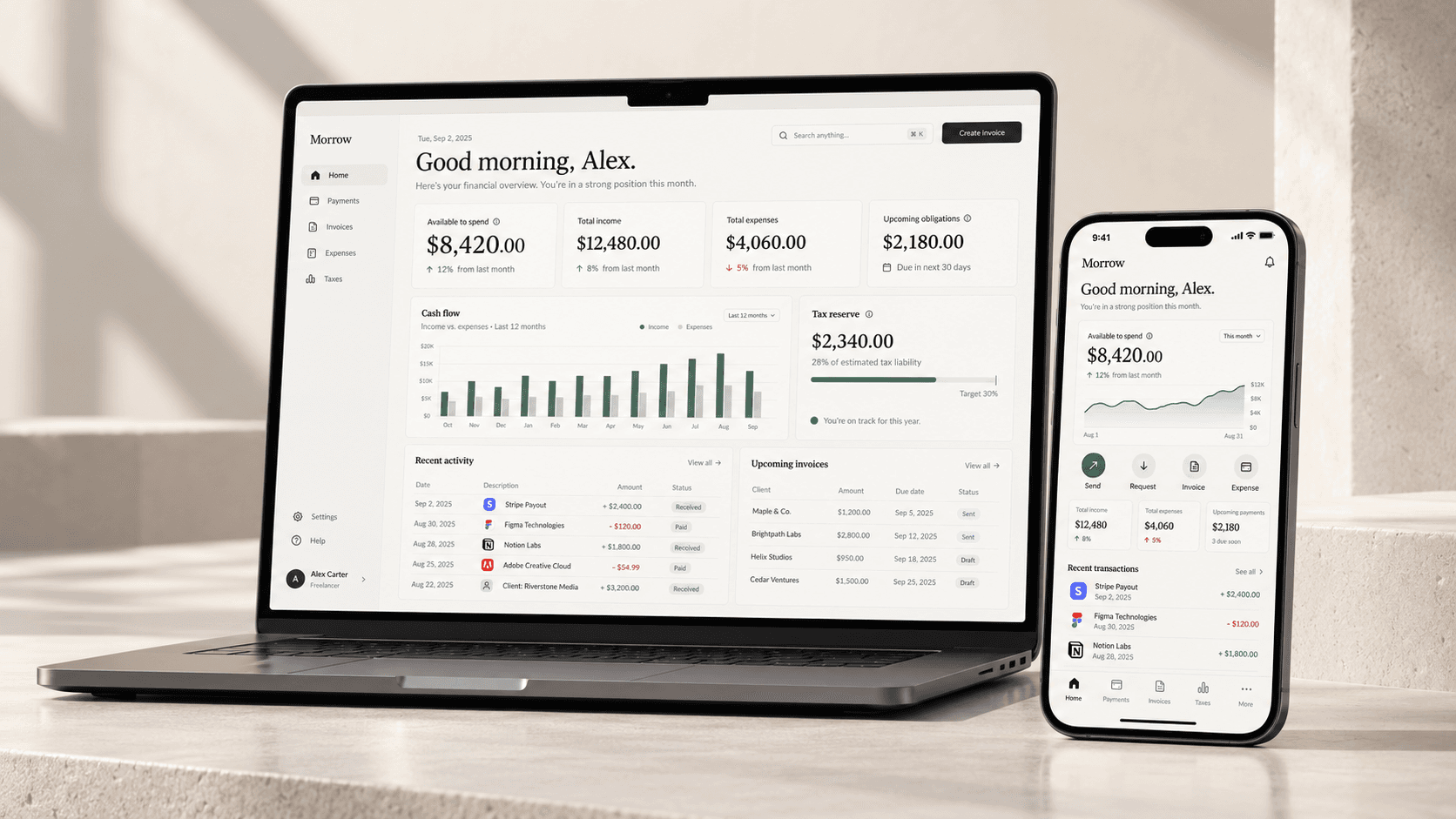
Morrow on a laptop and phone, showing an available-to-spend figure, cash flow, tax reserve and recent activity
Client
Morrow (concept)
Year
2025
Platform
Web & mobile
Scope
Product, brand, system

Studio concept. Morrow is an X-Studio exploration rather than client work, so every figure in the interface is illustrative. It is published to show how the studio thinks about financial products, not to claim a shipped result.

01 · The project

Freelancers don't get a salary. Their banking app assumes they do.

Money arrives from different clients on different days. Expenses move unpredictably. Tax sits in the background growing quietly. And the dashboard on the screen answers a question nobody asked, which is what the balance happens to be at this second.

Morrow is a concept for a financial operating system built around the reality of independent work. It brings income, expenses, invoices, taxes, savings and cash-flow forecasting into one workspace that is organised around decisions rather than transactions.

X-Studio ran the whole exploration: product strategy, UX, interface design, brand, the design system and motion direction, as one piece of thinking rather than six handoffs.

02 · The opportunity

Most finance products are organised around accounts. Independent work isn't.

For someone working for themselves the mental model is a loop: earn, receive, spend, set aside, plan, repeat. The product's job is to make that loop visible instead of handing over a statement and expecting interpretation.

So we designed the interface around six questions rather than around a chart of accounts. Answer those well and the spreadsheet becomes unnecessary.

  • What came in?

  • What went out?

  • What is committed?

  • What has to be kept for tax?

  • What is safe to spend?

  • What is coming next?

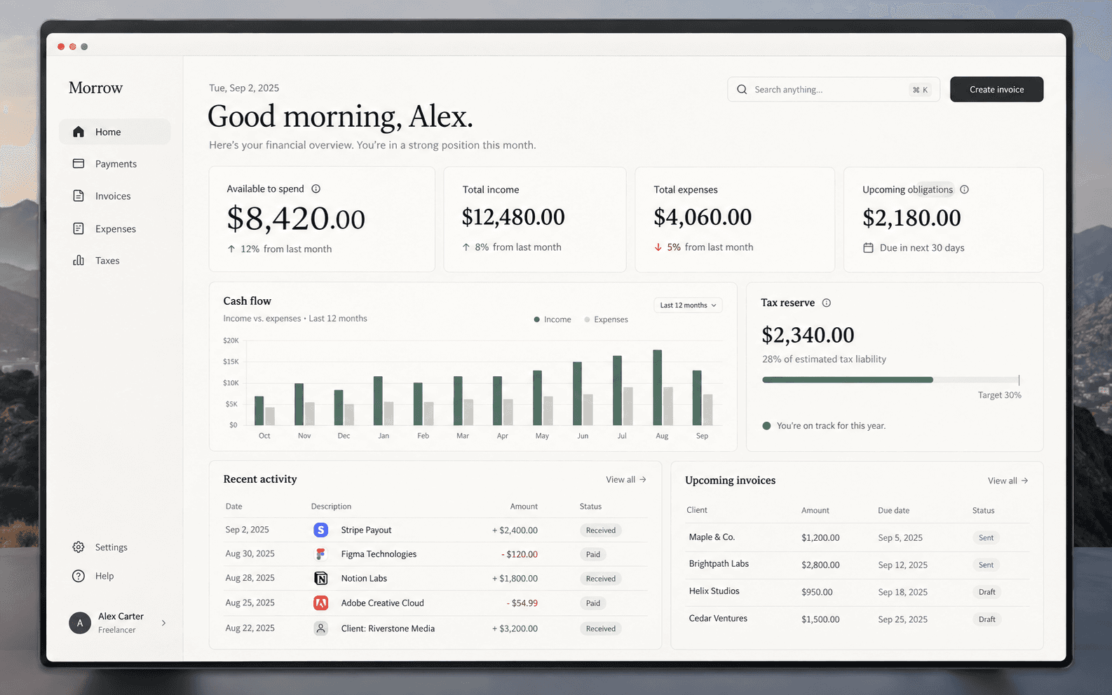
The Morrow home screen answering what came in, what went out, what is committed and what is safe to spend
The home screen is the six questions, answered. Available to spend sits first because it is the only number that resolves into a decision.

How much can I actually spend?

The question every other dashboard left unanswered

03 · Product principles

Three rules the interface had to obey.

  • Show the number that matters

    The first screen answers the question without asking anyone to do arithmetic. Available to spend, not balance, not revenue, not cash.

  • Make complexity quiet

    Tax, invoices, subscriptions and expenses are tangled underneath. Progressive disclosure and restrained hierarchy keep the surface calm.

  • Turn activity into foresight

    A dashboard that only reports the past is a receipt. Morrow is built to show what is likely to happen next.

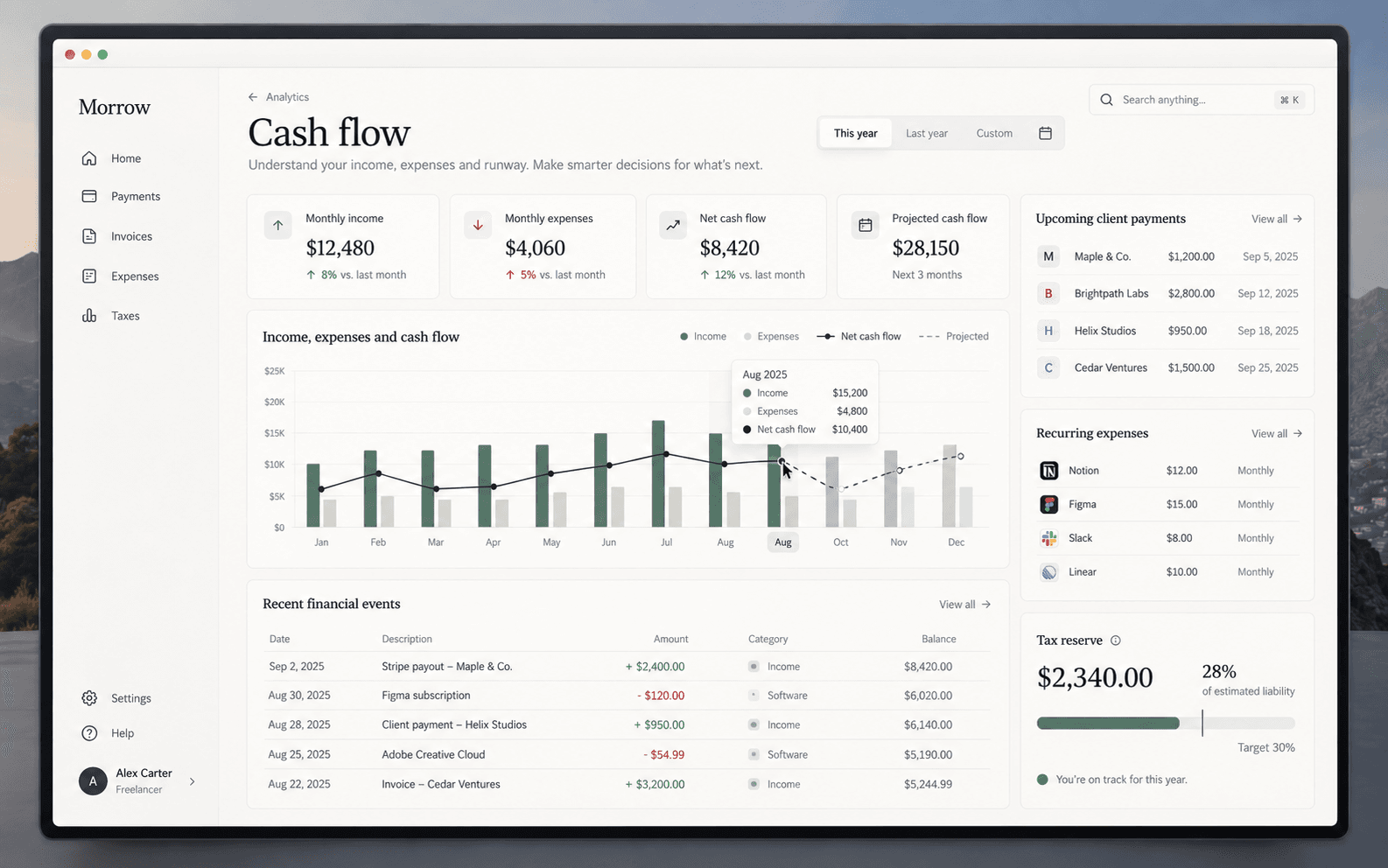
Morrow cash flow analytics showing income against expenses, net cash flow and a projected three month runway
Foresight rather than a receipt. The projected line is the part that changes behaviour, because it turns a record of the past into a decision about next month.

04 · The signature interaction

One number, and the four things standing behind it.

  1. 01Current balanceWhat is genuinely in the account today, before anything is claimed against it.
  2. 02Less upcoming expensesCommitted money that has not left yet. Known, dated, and already spent in every sense that matters.
  3. 03Less estimated taxReserved automatically as income arrives, so it never has to be found later.
  4. 04Less reserved savingsMoney already promised to a goal. Visible, so the promise is easy to keep.

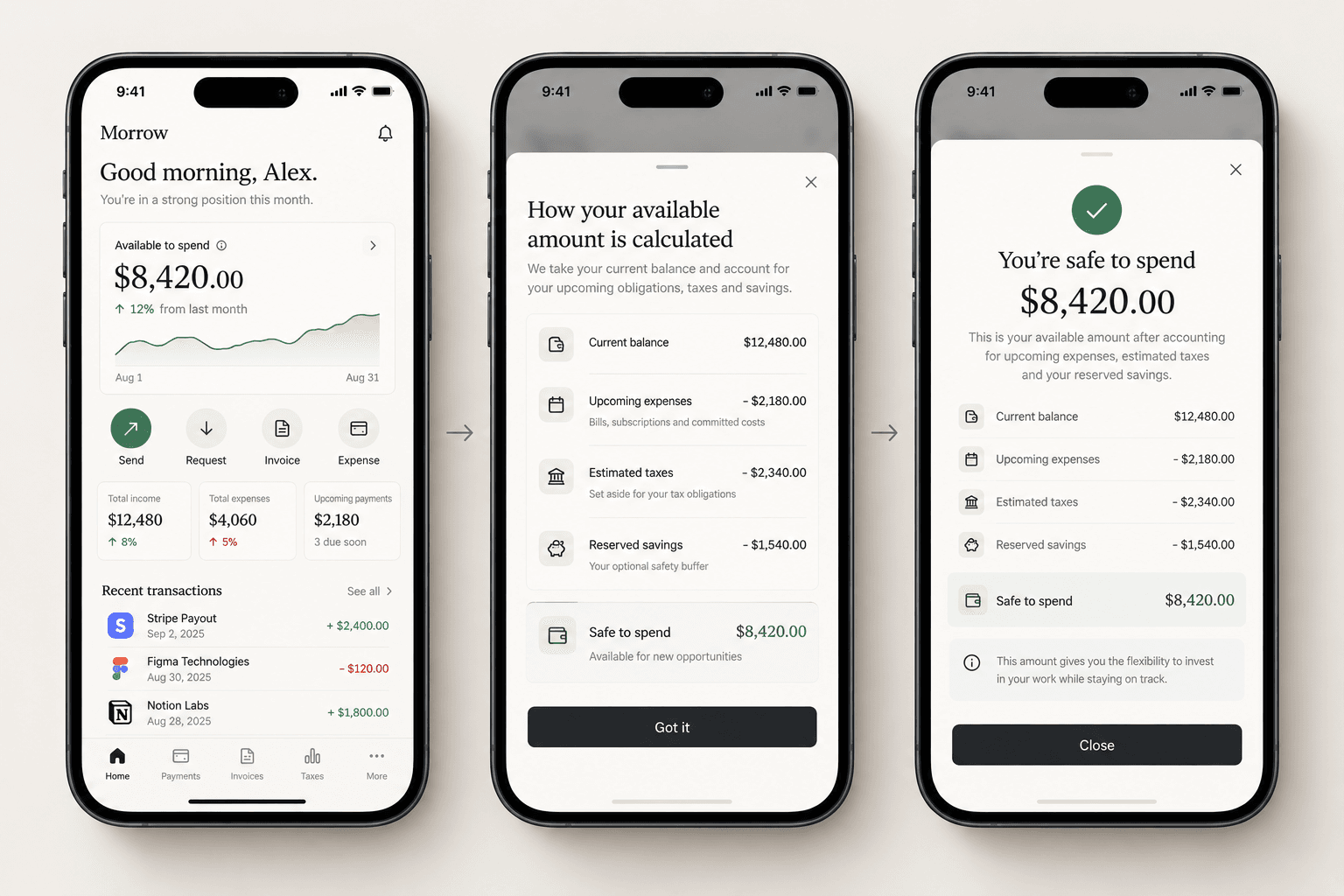
Tap the number and the calculation opens.

The result is safe to spend. The interaction is deliberately small: one figure at the top of the screen, and a tap to reveal exactly how it was reached. The complexity stays available without ever becoming the main experience.

Three phone screens showing the available amount, the calculation behind it and the confirmed safe-to-spend result
One tap opens the arithmetic: balance, less what is committed, less tax, less what has been promised to savings. The complexity is available without ever being the first thing anyone sees.

05 · The core experience

Five surfaces, one financial picture.

  • Home

    A financial overview rather than a statement. Hierarchy runs decision first, then context, then detail.

  • Payments

    Incoming and outgoing money in one view: client payments, subscriptions, transfers, pending income and status.

  • Invoices

    Treated as part of the financial system rather than a separate tool, with expected payment dates tied back to clients.

  • Taxes

    Morrow estimates what should be reserved and presents it as a normal part of the plan, not as a warning.

  • Expenses

    Categorised automatically and reviewed on a clean timeline, to answer the only question that gets asked: where did it go?

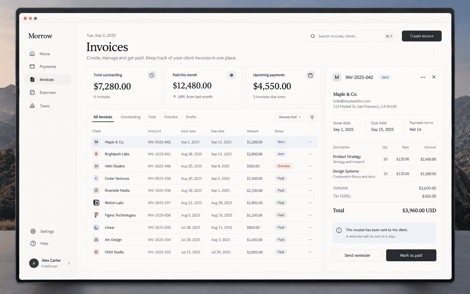
The Morrow invoices view showing outstanding totals, an invoice list and a selected invoice with its line items
Invoices sit inside the financial system rather than beside it, so an unpaid invoice is visible as future cash rather than as a document in another tool.
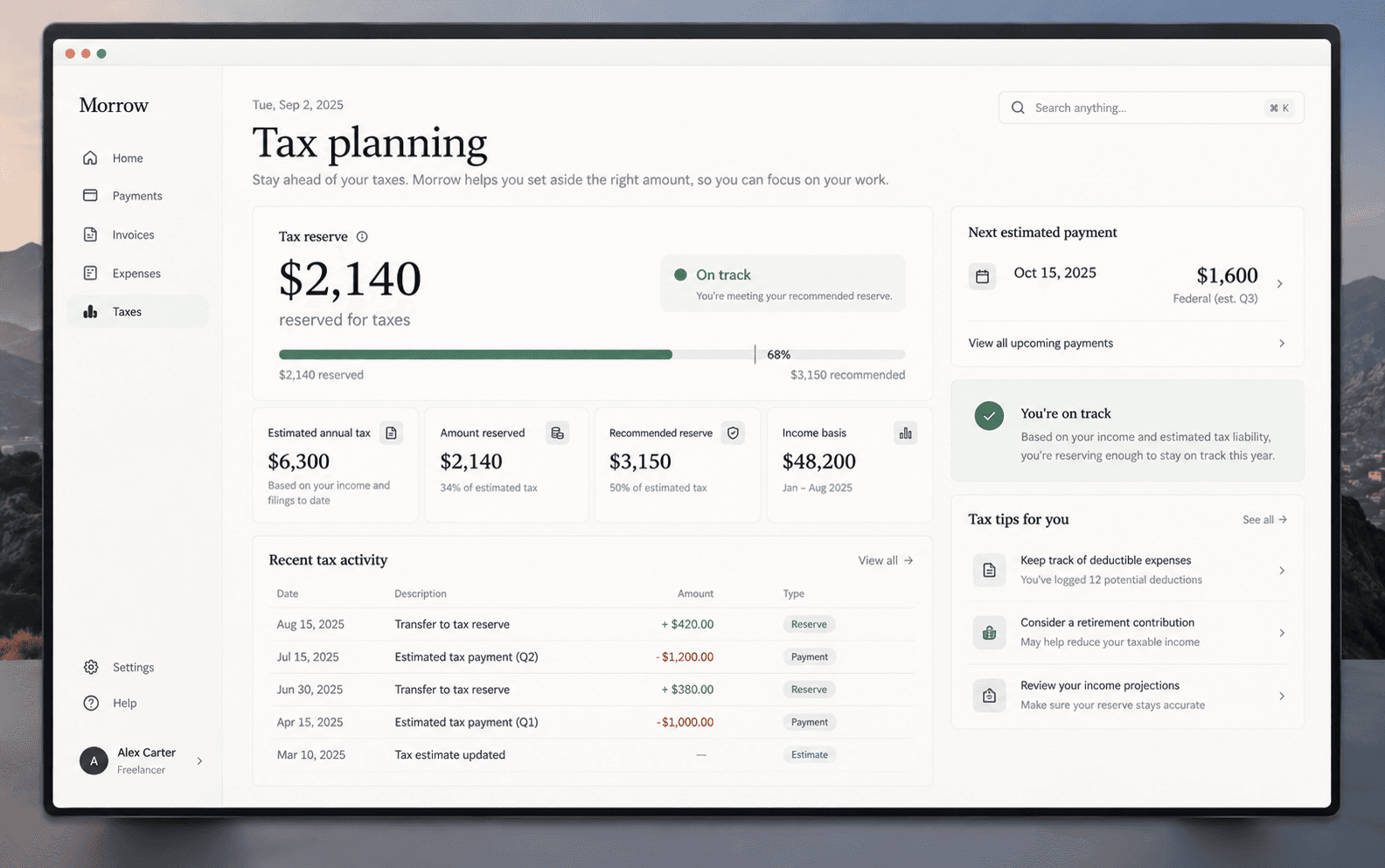
The Morrow tax planning view showing the amount reserved, the recommended reserve and upcoming estimated payments
Tax is framed as a plan being met, not a liability being announced. The difference is entirely tone, and it is the difference between a product people trust and one they avoid opening.

06 · Responsive design

Information is reorganised, not compressed.

Desktop

The environment for overview and deeper analysis.

  1. 01Review the month
  2. 02Reconcile payments
  3. 03Build and send invoices
  4. 04Plan around forecast

Mobile

The environment for a decision made between two meetings.

  1. 01Check
  2. 02Decide
  3. 03Act
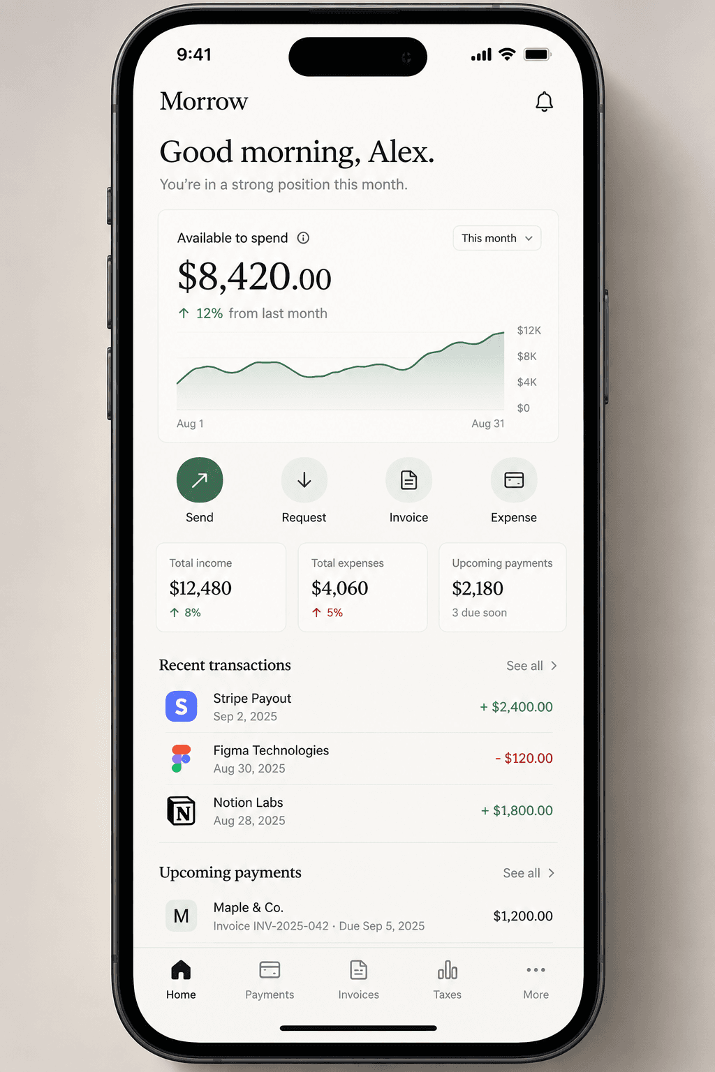
The Morrow mobile home screen showing available to spend, quick actions and recent transactions
Mobile keeps the number, the four actions and nothing that needs studying.

07 · Visual direction

Premium financial product, not banking software.

  • Typography

    Large editorial headings against highly legible interface text.

  • Colour

    A quiet neutral foundation with a single restrained accent for positive states.

  • Surfaces

    Soft cards, subtle borders, minimal shadow and generous spacing.

  • Motion

    Movement communicates financial state rather than decorating the screen.

08 · The design system

Small enough to stay quiet as the product grows.

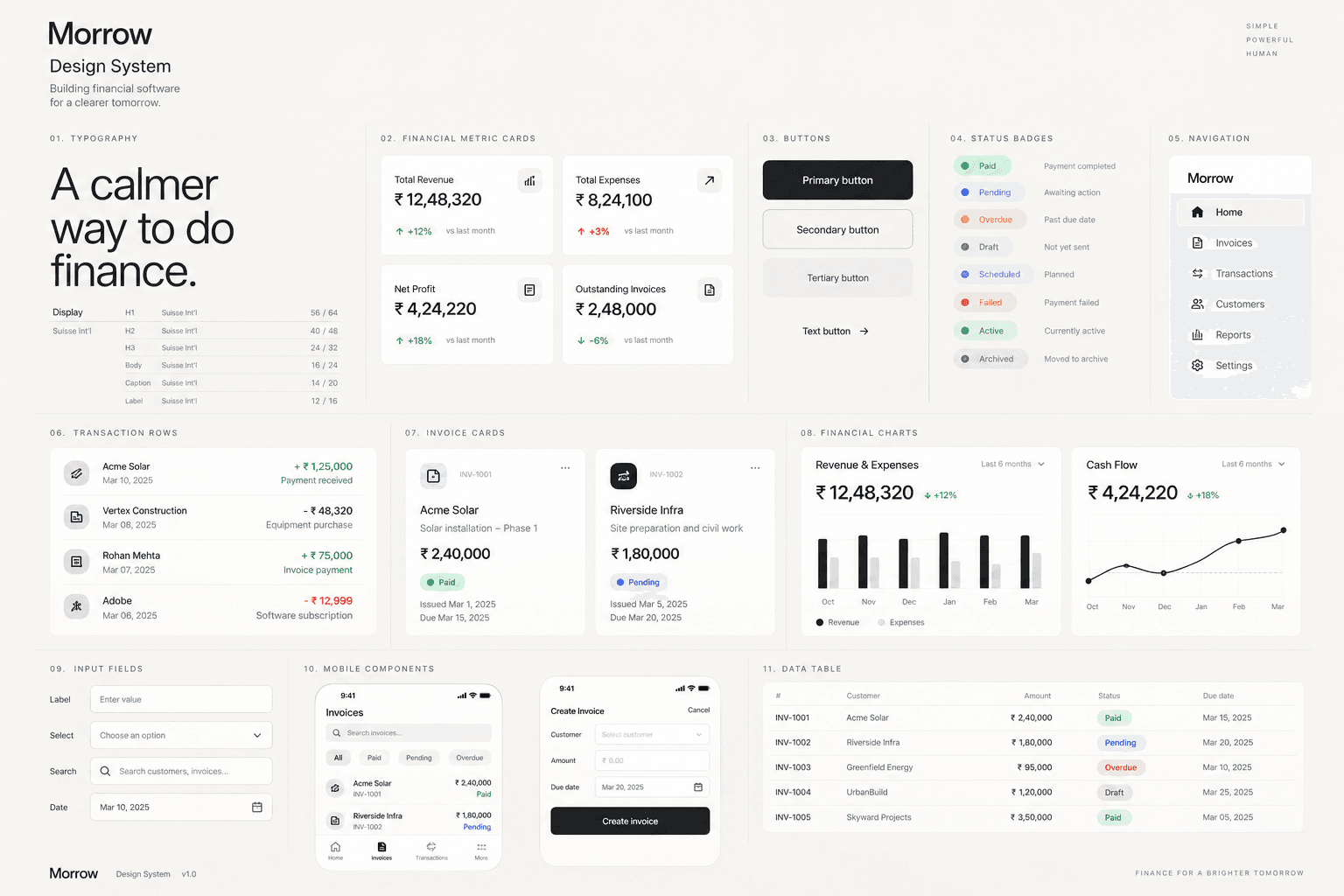
The system is built from a compact set of primitives: navigation, metric cards, financial charts, transaction rows, status indicators, invoice cards, amount inputs, date selectors, action buttons and mobile navigation.

Keeping it small is the point. A financial product accumulates features faster than almost anything else, and a sprawling component library is how interfaces become noisy two years after launch.

The Morrow design system board showing typography, metric cards, buttons, status badges, transaction rows and charts
Eleven groups of primitives, and a deliberate refusal to add a twelfth without a reason.

09 · The takeaway

Closer to an operating system than a banking app.

Morrow let us explore how financial software can move away from dashboards full of numbers and toward interfaces that communicate confidence, context and the next action. For someone whose income is their own responsibility, that difference is the product.

Got something worth building?

Contact Us