
X-StudioX-Studio
All case studies
X-StudioX-StudioCase Study

X-Studio × Kite · 2025

Intelligence for the teams building the physical world.

Kite is field operations software that assumes the user is on a roof rather than at a desk. One shared operational layer for dispatchers, managers and technicians, in the form each of them actually needs.

What we did

  • Product Strategy
  • Product Design
  • Systems Design
  • Enterprise UX
  • Design System
  • Prototyping
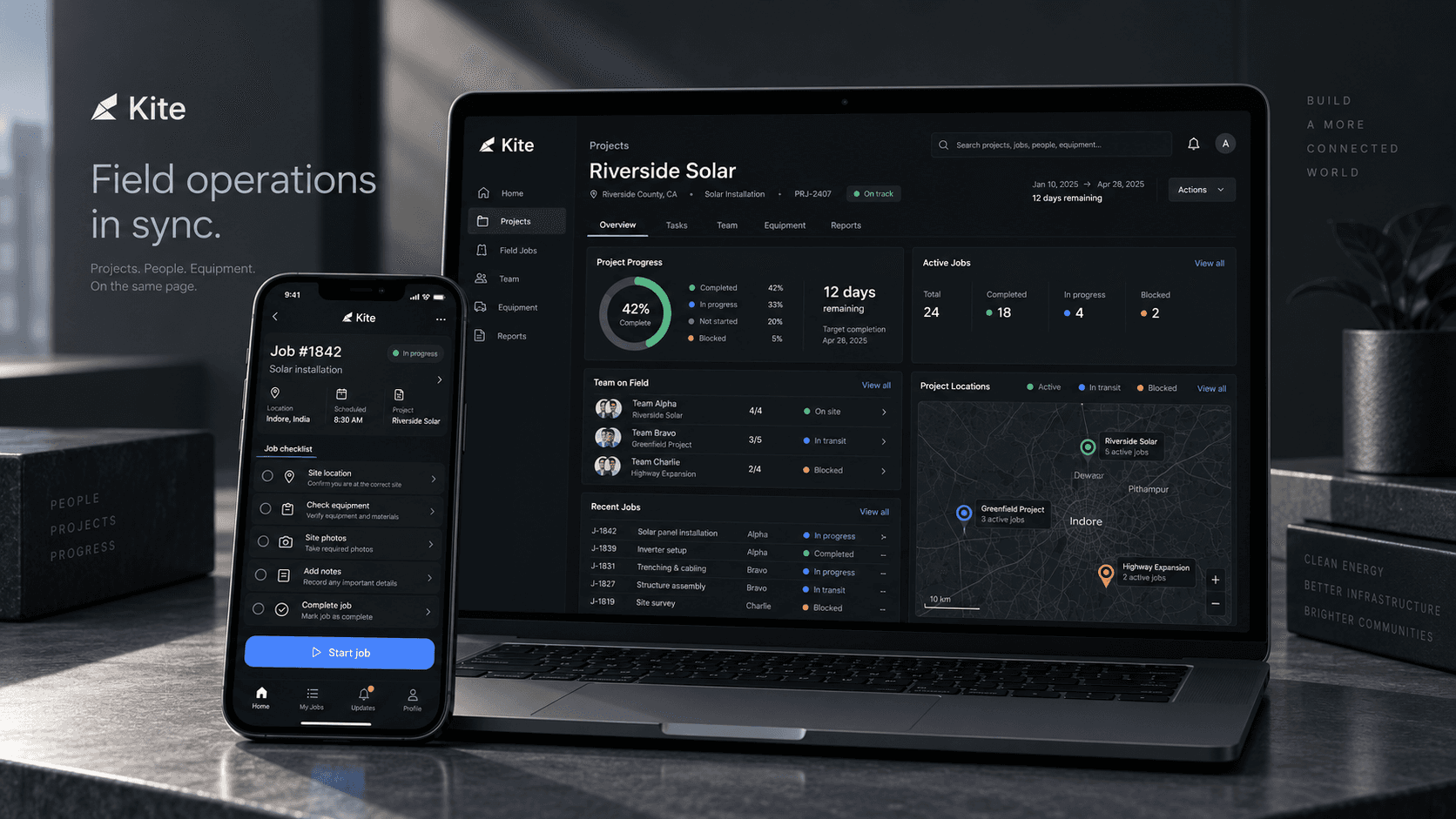
Kite on a laptop and phone, showing a solar project dashboard beside a technician job checklist
Client
Kite (concept)
Year
2025
Platform
Web & mobile
Scope
Enterprise product & system

Studio concept. Kite is an X-Studio exploration rather than client work. It is published to show how the studio approaches complex operational software, not to report a deployment.

01 · The project

Most software assumes you are sitting down.

Construction, solar installation, maintenance, infrastructure and service companies coordinate people, equipment, jobs, schedules and information every day. Almost none of that work happens at a desk.

Kite is a concept for field operations software that starts from the opposite assumption: the product has to work wherever the work happens. It creates a shared operational layer between the office and the site.

This was the most technical exploration in the set, and the one where usability is measured by how quickly real work can move forward.

02 · The opportunity

Four people, one truth, four different shapes.

Field operations are fragmented by nature. Everyone needs the same source of truth, but a dispatcher and a technician need it in forms that have almost nothing in common.

  • The project manager

    Is looking at a dashboard and needs to know what is at risk today.

  • The technician

    Is standing on a job site with one hand free and needs the next action.

  • The dispatcher

    Is moving schedules and needs to see who is available right now.

  • The operations lead

    Is tracking equipment across sites and needs location with status.

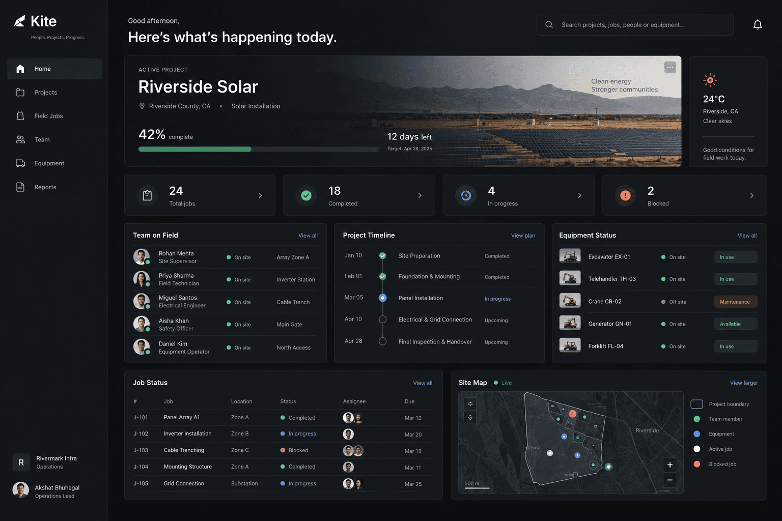
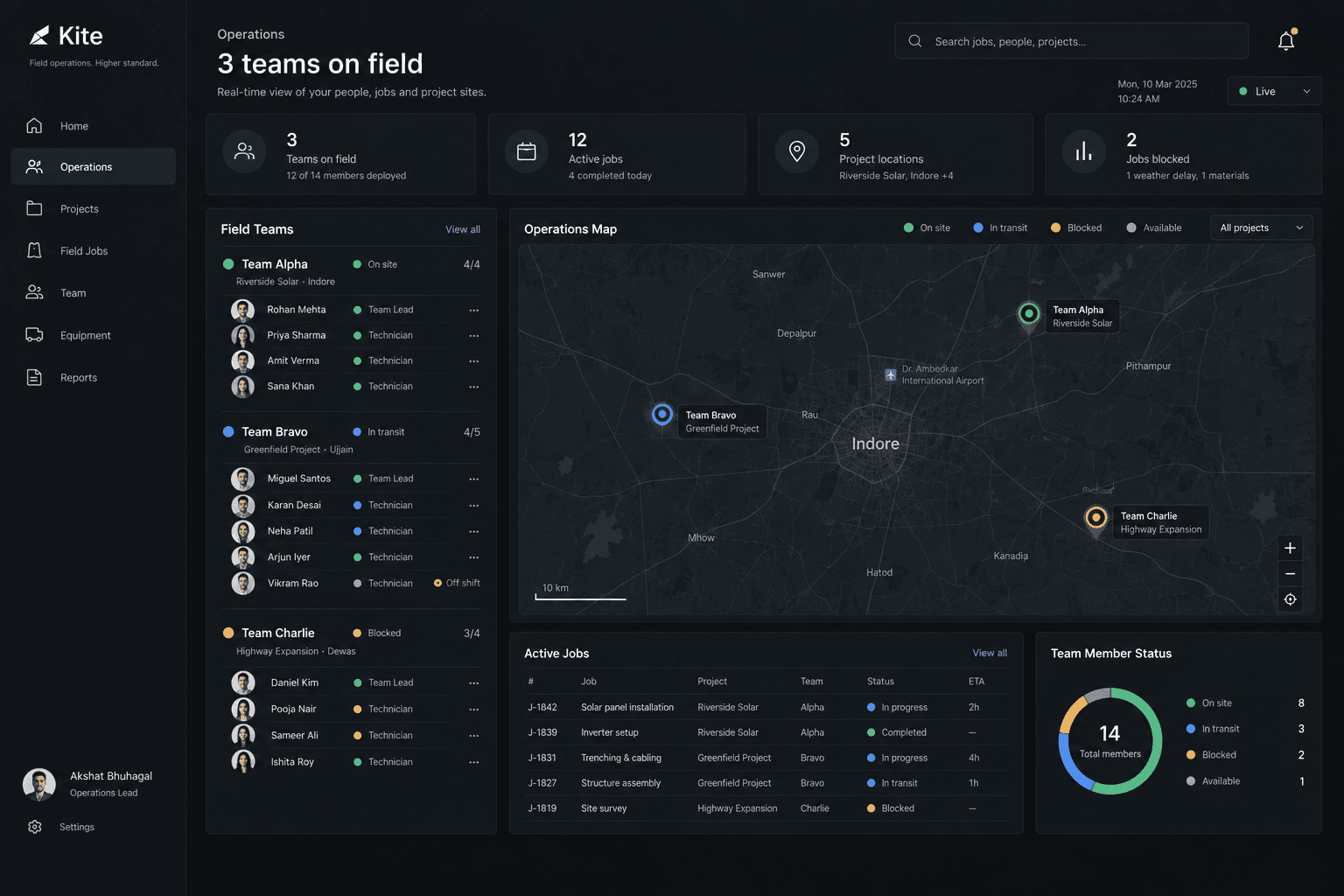
The Kite operations home showing the active project, job counts, team on field, project timeline, equipment status and a live site map
The office view. Everything on this screen resolves into a decision about today: who is where, what is blocked, and what needs a person sent to it.

The product has to work wherever the work happens.

The constraint that decided the architecture

03 · Product principles

Designed for imperfect conditions.

  • One system, different contexts

    The office and the field share the same underlying data without being forced into the same interface.

  • Make status obvious

    On site. In progress. Blocked. Complete. Operational software earns its keep by making important states impossible to miss.

  • Design for the real world

    Limited connectivity, dirty hands, bright sunlight, noise and very little time. The mobile experience is built for all five.

  • Turn data into action

    A dashboard is only useful when it helps somebody decide what happens next. Every view ends in something you can do.

04 · The backbone

Every job moves through the same six states.

  1. 01AssignedThe job has an owner. Nothing is sitting in an inbox waiting to be noticed.
  2. 02ScheduledA time and a place, visible to the office and the field at once.
  3. 03On siteArrival is a state, not a phone call. The dispatcher stops having to ask.
  4. 04In progressChecklists, photos, notes and issues attach to the job as the work happens.
  5. 05ReviewThe office sees what was done before it is closed, while the crew is still nearby.
  6. 06CompleteThe record is finished at the site rather than reconstructed that evening.
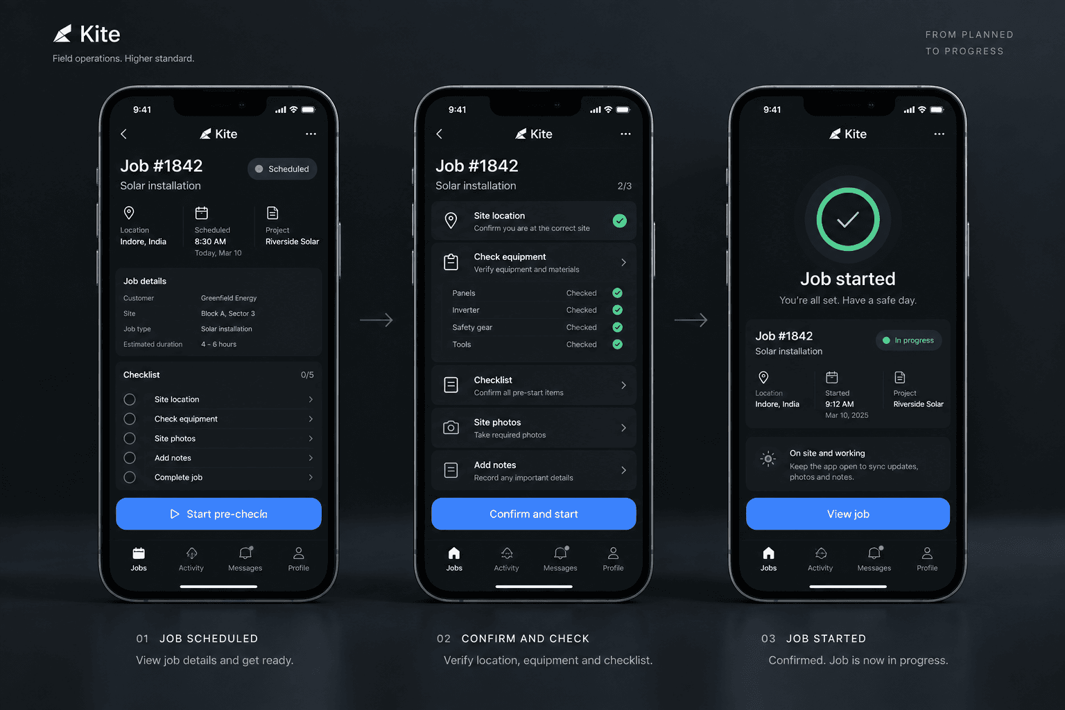
Three phone screens showing a scheduled job, the pre-start equipment and location checks, and the confirmation that the job has started
Scheduled, confirmed, started. The pre-start checks exist so the status the office sees is true rather than optimistic.

05 · The core experience

One operational picture.

  • Projects

    Progress, schedule, open jobs, team status, equipment, issues and reports without opening a second tool.

  • Field jobs

    The status model is the backbone of the product, and every job carries its own lifecycle.

  • Team

    Who is working, current assignment, availability and job status. Built to support coordination, not surveillance.

  • Equipment

    Availability, assignment, maintenance, location and issues, tied to the projects that depend on them.

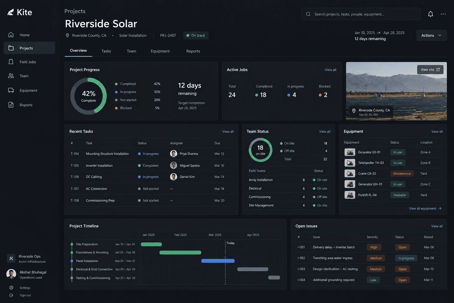
The Riverside Solar project view showing progress, active jobs, recent tasks, team status, equipment and open issues
A project is one page. Progress, people, equipment, timeline and open issues, without opening a second tool to assemble the picture.

06 · The field interaction

Start job. Then one obvious thing at a time.

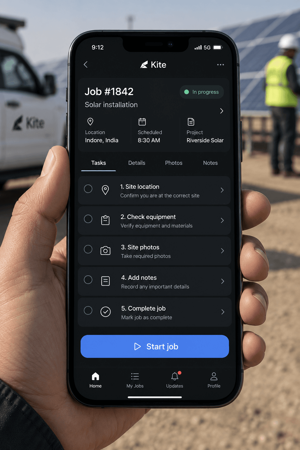
Before starting, the technician sees location, scheduled time, equipment, the required checklist and any relevant notes. During the job they can check equipment, upload photos, add notes, report an issue and work through the checklist.

The closing action is deliberately the most prominent element on the screen. Complete job is a single, unambiguous target, because the last thing a person wants at the end of a job is a form.

A technician holding a phone on a solar site, showing the Kite job checklist and a large start job button
The screen as it is actually used: outdoors, one-handed, in sunlight, with gloves nearby. Start job is the largest target on it for a reason.

07 · The map

Location is operational context, not decoration.

The map can show active jobs, team members, equipment, project sites and issues. It never shows geography alone: every pin is paired with a status and something you can act on, so the map answers a question rather than illustrating one.

The Kite operations map showing three field teams positioned across sites, with active jobs and team member status
Location paired with status. A pin that cannot tell you whether the team is on site, in transit or blocked is decoration.

08 · Responsive design

Two expressions of the same operational system.

Desktop

Where the day is planned and the week is understood.

  1. 01Coordinate
  2. 02Monitor
  3. 03Analyse

Mobile

Where the work is actually done.

  1. 01Navigate
  2. 02Execute
  3. 03Document

09 · Visual direction

Clarity under pressure, not simplicity for its own sake.

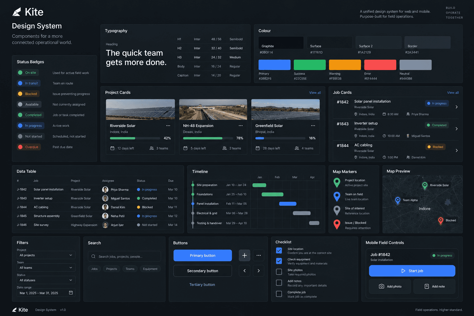
  • Typography

    Compact, high legibility, with a strong numerical hierarchy.

  • Colour

    A dark operational interface where status colour is reserved for meaning.

  • Layout

    Dense where it has to be, structured by clear grids and strong grouping.

  • Motion

    Movement reports live change: status, availability, progress, completion.

The Kite design system board showing status badges, typography, colour, project and job cards, data tables, timelines and mobile field controls
The status badges come first in the system for the same reason they come first in the product: everything else is built on knowing what state something is in.

10 · The takeaway

Enterprise software without the operational tax.

Kite let us explore a different side of product design, where the measure of quality is not how clean a screen looks but how fast a crew can get to the next job. Connecting operational teams should not add operational complexity, and most software in this category does exactly that.

Got something worth building?

Contact Us